When I think about why Airbnb has such iconic branding, I can’t help but focus on its logo. It’s more than just a design; it represents belonging and connection. The vibrant colors draw you in, sparking a sense of adventure. But there’s much more to it. Airbnb doesn’t just sell a place to stay; it offers a chance to forge authentic experiences. Let’s unravel the layers behind this powerful brand.
Key Takeaways
- The logo evokes a sense of belonging, symbolizing a global community of travelers and hosts, fostering connection and shared experiences.
- A vibrant color palette sparks emotions and adventure, inviting users to dream about future trips and create lasting memories.
- Community-driven experiences focus on local culture, building trust between travelers and hosts for authentic interactions and memorable journeys.
- Consistent messaging across platforms strengthens brand identity, using clear, inviting visuals and language to promote a sense of belonging.
- Storytelling through user experiences crafts compelling narratives that inspire future travelers and highlight the interconnectedness of different journeys.
The Power of the Logo: A Symbol of Belonging

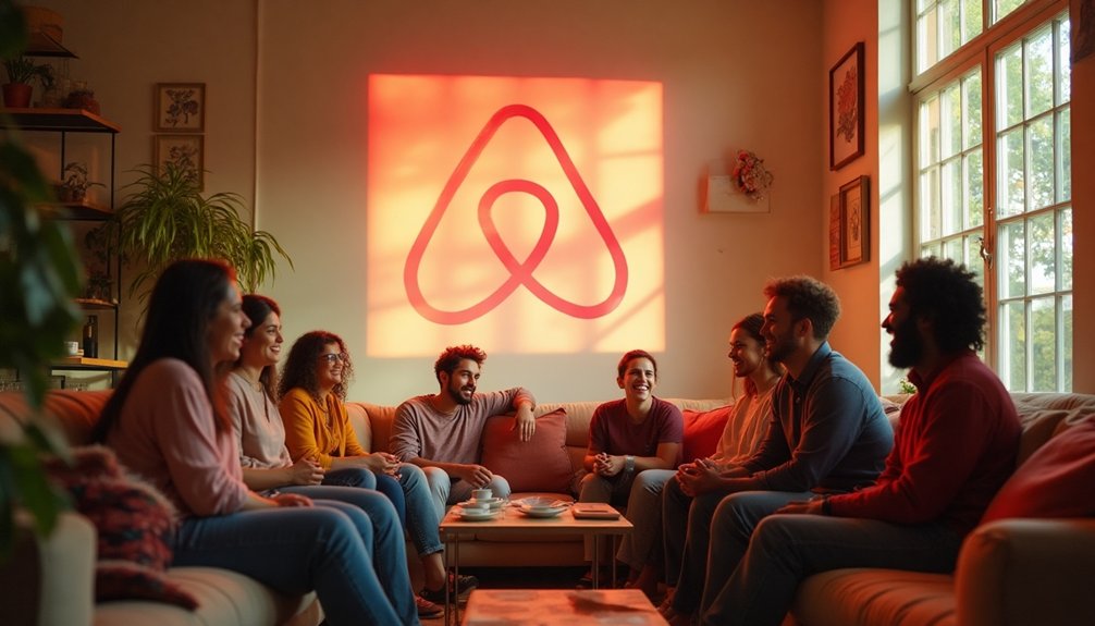
When I see the Airbnb logo, it instantly evokes a sense of belonging and community. It’s more than just a symbol; it represents shared experiences and connection.
Each time I spot it, I’m reminded of the countless places I’ve stayed and the unique people I’ve met along the way. The logo captures the essence of travel as an opportunity to create memories, not just in foreign lands, but in welcoming homes.
It reassures me that wherever I go, there’s a place that feels like home waiting for me. This powerful imagery encourages me to explore new cultures and build friendships.
It makes me believe that, through Airbnb, I’m always part of a larger global family.
Vibrant Color Palette: Evoking Emotion and Adventure

As I explore the world of Airbnb, I’m captivated by its vibrant color palette, which sparks feelings of emotion and adventure. Each hue seems purposely chosen to evoke a sense of warmth and excitement.
The bold reds and oranges make me think of sunsets over new horizons, while tranquil blues and greens remind me of serene getaways. This dynamic blend pulls me in and encourages me to dream about my next trip.
It’s as if the colors invite me to create inspiring memories, whether I’m booking a cozy cabin or a chic apartment. I appreciate how this palette bridges diverse cultures and experiences, turning every stay into a colorful journey waiting to unfold.
It’s more than design; it’s an invitation to explore.
Community-Driven Experiences: Building Trust and Connection

One of the most compelling aspects of Airbnb is its focus on community-driven experiences, which truly builds trust and connection among travelers and hosts.
When I book a stay, I love that I’m not just renting a space; I’m diving into a local’s life and culture. Hosts often share their favorite spots, unique stories, and local insights, fostering a sense of connection.
This personal touch makes my travels feel more authentic and memorable. I appreciate knowing that every interaction I’ve is rooted in shared experiences and mutual respect.
Consistent Messaging Across Platforms: Strengthening Brand Identity

Although Airbnb offers diverse experiences and stays, maintaining consistent messaging across all platforms is essential for solidifying its brand identity.
I’ve noticed how they echo their core values of belonging and community in every tweet, post, and advertisement. This uniformity creates a cohesive image that resonates with users and builds trust.
When I see Airbnb’s vibrant visuals and inviting language, I immediately feel connected to their mission. Whether I’m browsing their website, scrolling through Instagram, or reading an email from them, the message is clear: everyone deserves to belong anywhere.
Storytelling Through User Experiences: Creating Memorable Journeys

Airbnb doesn’t just create a platform for stays; it crafts stories through the experiences of its users. When I browse through testimonials, I feel transported to various corners of the world, captivated by unique journeys.
Guests share tales of shared dinners and unexpected friendships, turning ordinary trips into unforgettable memories. I’ve often found myself inspired by these narratives, eager to explore more than just a new setting.
Airbnb encourages hosts to share their local culture, enriching the travel experience. Each booking becomes part of a larger story, weaving connections between people and places.
Conclusion
In conclusion, Airbnb’s branding isn’t just about eye-catching visuals; it’s about creating a sense of belonging and connection. Their logo, vibrant colors, and community-driven focus all work together to inspire travelers like us to embark on new adventures. By maintaining consistent messaging and sharing captivating stories, Airbnb turns each booking into a memorable journey. This approach not only enhances their brand but also invites us to be part of a larger narrative that truly resonates with our experiences.


